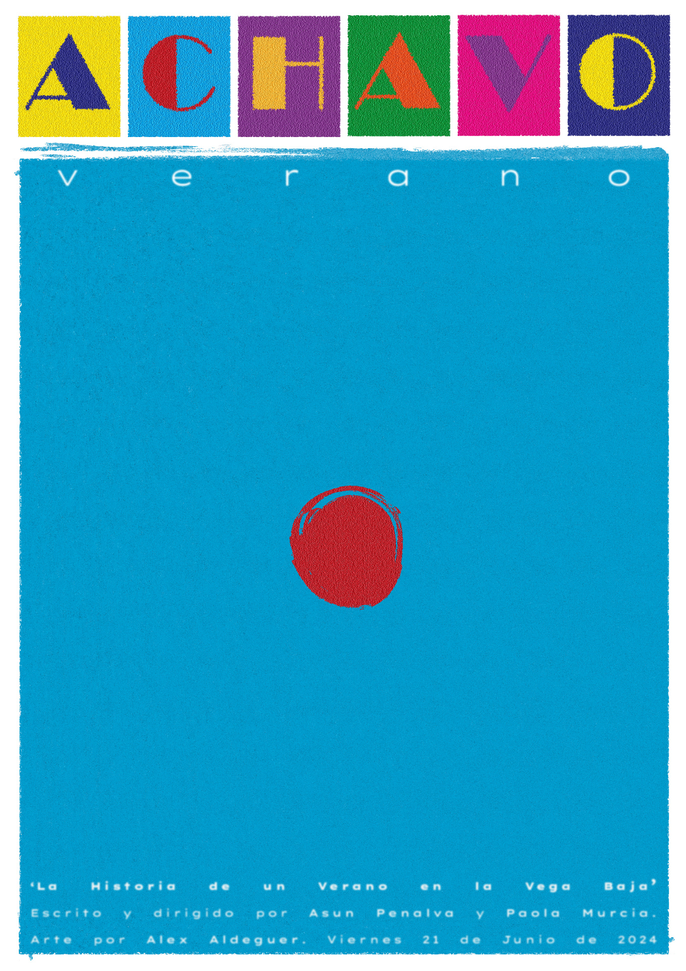
This poster encapsulates a multitude of sensations revolving around the experience of a TOURIST SPOT in the first person.
Tourism through my eyes is something like many things, often of great size, contained within a small point. Everything converges in it.
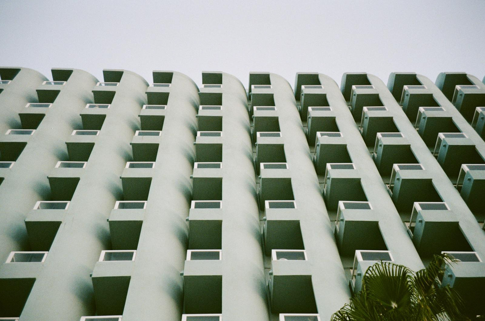
Analyzing the poster from top to bottom, the letters emerge from a moment of inspiration while simply observing coastal life unfolding around me. The typography is created from a mental photograph of a summer advertising truck. In tourism, everything must catch your eye through its shape and color—hence its construction. Additionally, these glyphs were widely used during the tourism expansion of the 1980s, giving Spain a distinct graphic identity tied to its newfound openness. Within these glyphs are colorful drinks, neon lights, and a life centered around the vibrancy of summer colors. The decision to place the letters inside boxes comes from the compressed, packed feeling of tourism. The letters are contained within something that constrains them.
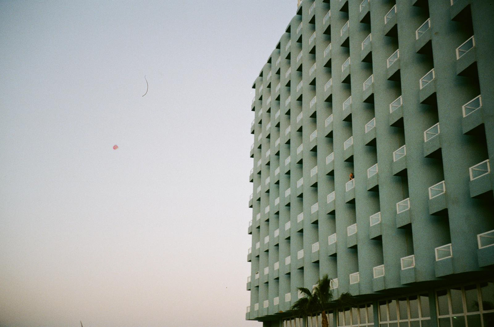
The background—this blue—refers to the sea and its hues, to that hotel… The sea, the background, is positioned above the dot because the dot is drowning due to the overwhelming concentration. This raises the question: Can the sea drown?
Finally, regarding the dot, the central element, its explanation is as stated. The concentration of something within a small point is the conceptual foundation. The red color, aside from being the corporate color of Achavo Magazine, represents a hotspot, something boiling over. The conceptual interpretation is left to the observer, who, without this explanation, can assign it meaning based on their visual culture. For some, it may be a dot; for others, a fruit. Some may see the sun, while others might think of a frisbee…
In the end, summer is a point where everything happens, and this point is always close to the sea.
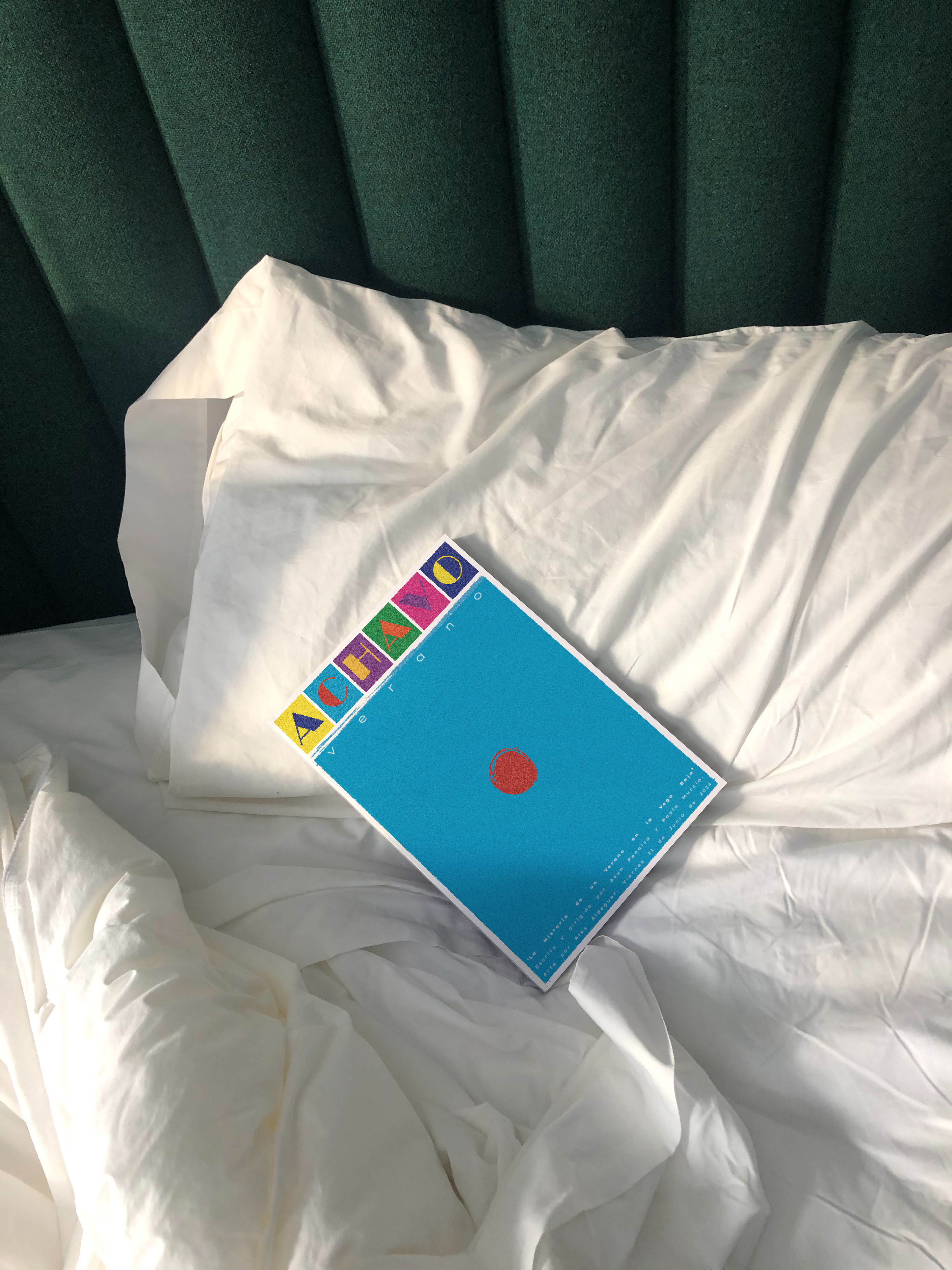
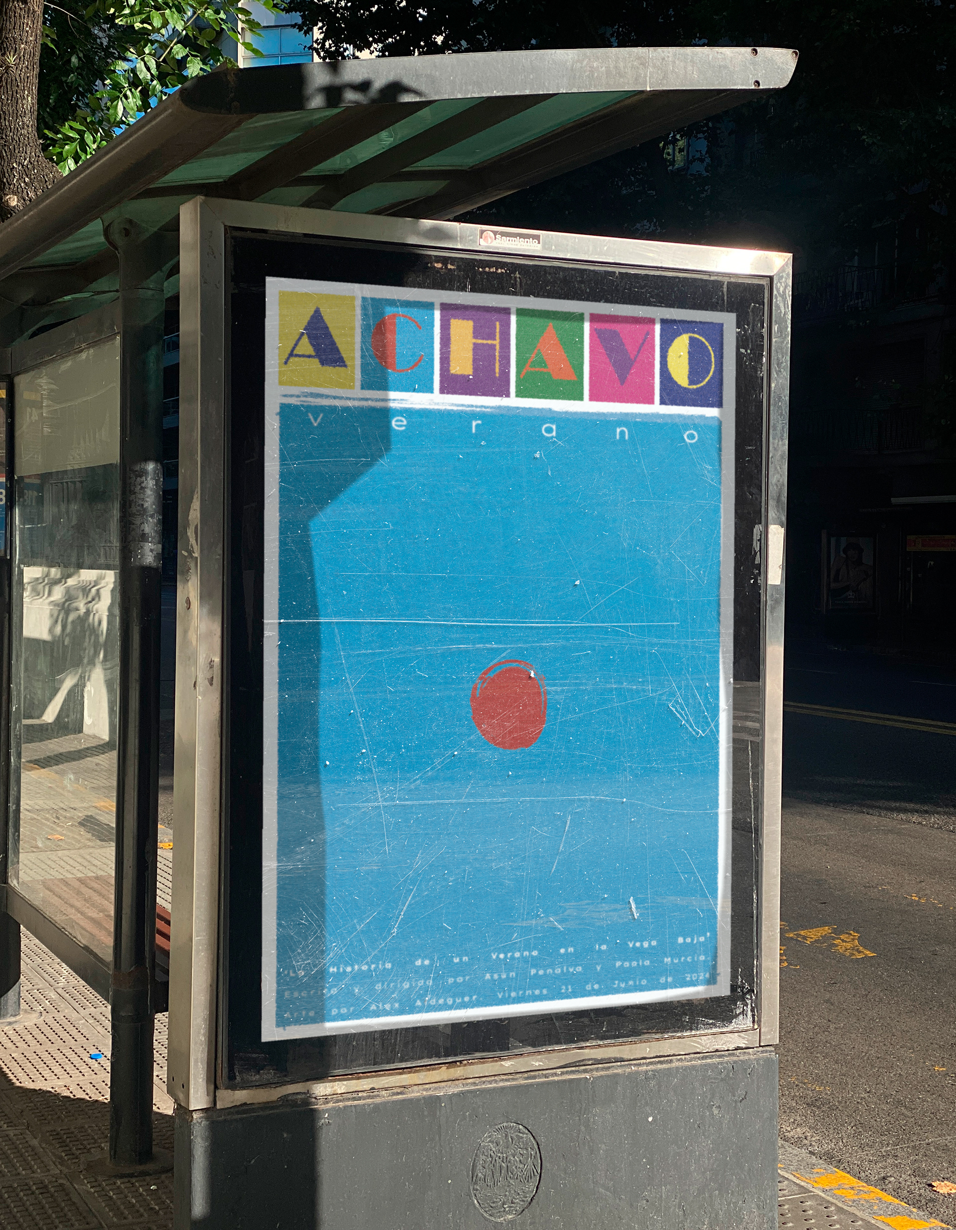
Poster for @Achavomagazine
Poster for @Achavomagazine